
You may have earned your color consulting certification for interior design and decorating. But that doesn’t mean you’re tied down to just that industry! Your skills are transferable!
Whether you’re starting your own business or working freelance, the same branding process applies. Aligning a company’s colors with its vision sounds difficult when you don’t know where to start. But your color consultant training should take you through the psychology of color and design basics. From there, it’s a hop, skip, and a jump away from becoming a color marketing master!
If you need a refresher or just want a crash course on branding with color, look no further! Keep reading to find out how to align a company’s colors with their goals!
The underlying psychology of color
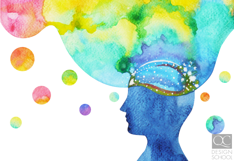
Color psychology is real—especially when it comes to branding! Besides the company name, the logo is next up in importance when forming first-impressions. Some brands opt to keep things simple with black and white, but color can offer huge benefits to a company’s branding! It’s one of the first things that catches your eye! But what impact does color have exactly?
Using your color wheel, you can see the relationships between different colors. Color schemes like those plotted in a complementary position look good and emphasize one another. When people perceive purple next to yellow, the response is physical. This means that it’s innate to see them as complementary to one another. The contrast is intense between the two so the brain perceives both colors as being brighter… and you can anticipate this using your trusty color wheel!
For a single-hue example, take the color red. Red is an energizing color often associated with rage, passion, and activity. In fact, when you see red, your heart rate actually increases! This is a clear physiological and natural response. However, some color associations are learned. Despite red being an energizing color, in recent times, we use red for traffic signaling. People have now learned to halt activity when they see the color red on the road!
Colors as symbols can even be culturally dependent. White, for instance, is a color of serenity and purity in the west. Meanwhile, it’s associated with death in East Asia and is often the color worn at funerals. Learning to consider all these factors when using color is your bread and butter as a color consultant for companies.
So what does this all mean in the grand scheme of things? Well, color has associated meanings. Each color can elicit a specific emotional response. Your job is to harness that knowledge to turn the emotional response into a behavioral response.

Increases brand recognition
In the external realm, color can plays a large part in brand recognition. Creating a reputable, familiar brand drives sales. What would McDonald’s be without its French Fry-esque golden arches? Millions all over the world recognize the golden arches without even seeing the company’s name. The yellow color used not only incites activity. It also promotes happy, positive feelings that you’ll hopefully associate with the fast-food chain in general!
Beyond just the logo, the rest of the company’s aesthetic should mesh. There’s a reason why sophisticated luxury cars like Mercedes-Benz or Lincoln don’t use hot pink at all! Colors should represent and sell the brand and their products or services. It is a huge factor in the overall presentation of a product. In fact, 93% of consumers say they favor color and appearance over other factors when making a purchase. If there is a jarring contrast between the color choice and the brand’s official messaging, you’ve got a problem.
Do some research
After you’ve discussed the company goals with your client, the next step is to do some research. Research other similar businesses! What colors are they using on their website or logo? If they sell products, what’s their packaging look like? Are they a luxury or budget-friendly company? What are other companies in the larger industry doing? Direct competitors will rival your clients in every way, so how can you help pull them ahead?
While the colors you choose should not be a duplicate of your clients’ competitors, some colors are a safe bet. The most commonly used color for company logos is blue; it’s professional and invokes trust. But just because companies like Twitter just use one color, doesn’t mean you have to! Mixing colors generates interest. It’s also an opportunity to convey several messages at once using the different colors. Be careful though, you may create visual clutter when you mix too many together!

The physical workspace
This is all looking externally. But what about the workplace? A company’s goals go beyond just external branding! To ingrain the same goal and mantra throughout the company, the corporate colors should show up in the physical workplaces, too.
For a company’s workspaces, you can put your color training to use when decorating or renovating the interiors. When choosing colors for the workplace, stay away from dark colors. They don’t reflect light well, leading to a dark and closed-in atmosphere. While their main spaces are often left neutral, companies like Google experiment with color all the time Social and meeting spaces can benefit from bright, lively color schemes!
On the other hand, bright colors could also pose a problem. While yellow has a strong association with memory (3M actually conducted this research for their yellow Post-It notes!), it could also be an irritating color. It’s so highly reflective, that its intensity could have the opposite effect in productivity when used in high amounts.
Most companies choose neutral colors to paint their office spaces. Neutrals, in this case, mean beige or gray. But there isn’t just one shade or beige or gray. Undertones exist! To determine a neutral’s undertone, put place it in contrast to other colors present in the work spaces. You could also place it next to a pure white shade for comparison. Don’t forget to examine the chosen colors under the exact same light conditions as found in the office. The temperature of your lighting will change the tone of your colors!
Are there any other ways colors can help with goal-achievement? Let us know!