- The 2026 Colors of the Year reflect calm, warmth, and natural elegance.
- Each major brand selected a distinct color with a shared design theme.
- Color of the Year selections are driven by cultural mood and design trends.
- The 2026 colors are highly versatile for both residential and professional design.
- Feng Shui adds an energetic layer to 2026 color choices.
- Small color updates can have a big impact.
- Expert guidance reinforces intentional color use.
Introduction
The 2026 Colors of the Year are here, giving a glimpse into what’s in style this year. From Pantone’s soft, minimalist white to Behr’s moody green, this year’s top hues reflect clarity, calm, and natural elegance.
We’ve broken down the official color picks from Pantone, Benjamin Moore, Behr, and Sherwin-Williams, and gathered ideas for how to use them—whether you’re decorating your own space, designing for clients, or building your portfolio.
Keep reading to find out the 2026 Colors of the Year!
What Is the Color of the Year—and Why Does It Matter in Home Decor?
Every year, top paint brands and other design authorities announce their much-anticipated Color of the Year. This single shade is more than just a trend—it reflects the current design landscape, cultural mood, and sets the tone for the year ahead.
For designers, decorators, and color consultants, knowing these colors is key to staying current. The Color of the Year influences everything—from client preferences and furniture selections to product styling and marketing trends. By understanding how to use these trending shades, you can bring fresh ideas to your projects, align with what clients are naturally drawn to, and stand out in your design work.
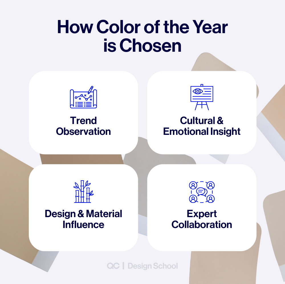
How Are Colors of the Year Chosen?
The Color of the Year isn’t a random decision. A lot of thought and research goes into determining which shade each brand selects. According to Better Homes & Gardens, most companies approach the process by analyzing trends, emotional tone, and design direction.
Here’s how it typically works:
- Trend Observation: Experts track what’s happening in fashion, interiors, architecture, lifestyle, and even technology.
- Cultural & Emotional Insight: They look at the collective mood—what people are feeling and what energy they’re seeking in their spaces.
- Design & Material Influence: Changes in materials, finishes, and creative trends help shape what’s relevant and inspiring.
- Expert Collaboration: Color forecasters, designers, and creative professionals work together to decide which shade best captures the year ahead.
2026 Color of the Year Picks by Brand
So, here’s the moment we’ve all been waiting for: the 2026 Colors of the Year. We’ve broken down the top picks from Pantone, Benjamin Moore, Behr, and Sherwin-Williams so you can see how each one fits into this year’s design story.
While each brand’s pick has its own personality, a clear theme ties them together: softness, warmth, and quiet confidence. They reflect a collective desire for comfort, stability, and deeper connection with our surroundings—whether at home or in professional spaces.
Pantone – Cloud Dancer (11-4201)
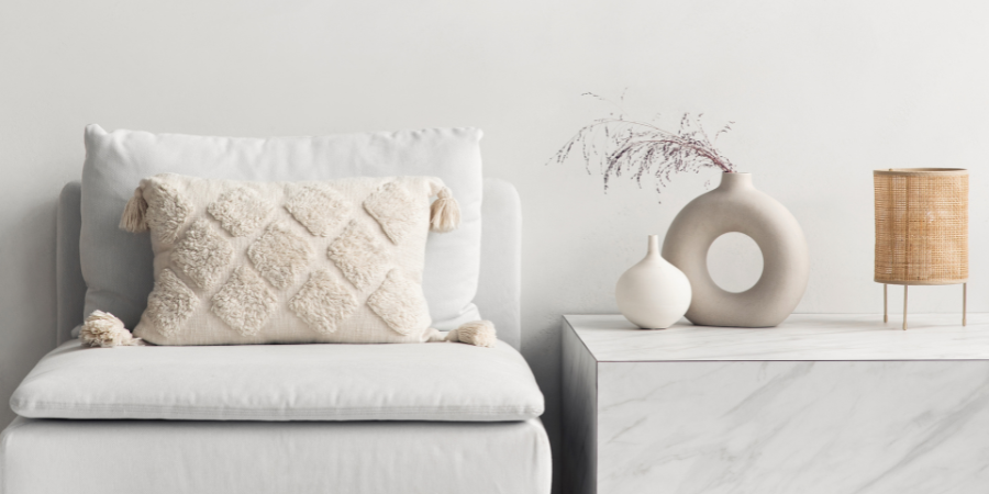
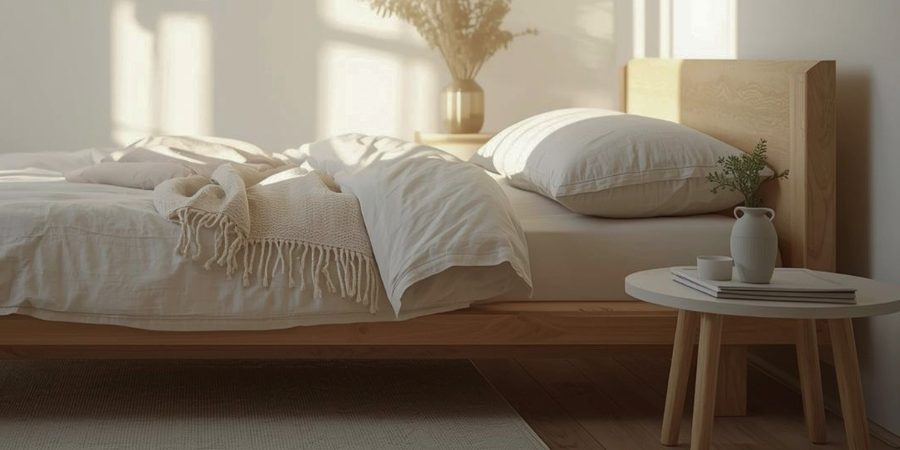
Pantone, a global color authority known for its standardized color system, selected Cloud Dancer (11-4201) as its 2026 Color of the Year. This soft, airy white reflects clarity, calm, and a desire for creative openness. The shade symbolizes a fresh start and creates space for thoughtful, intentional design.
Benjamin Moore – Silhouette (AF-655)
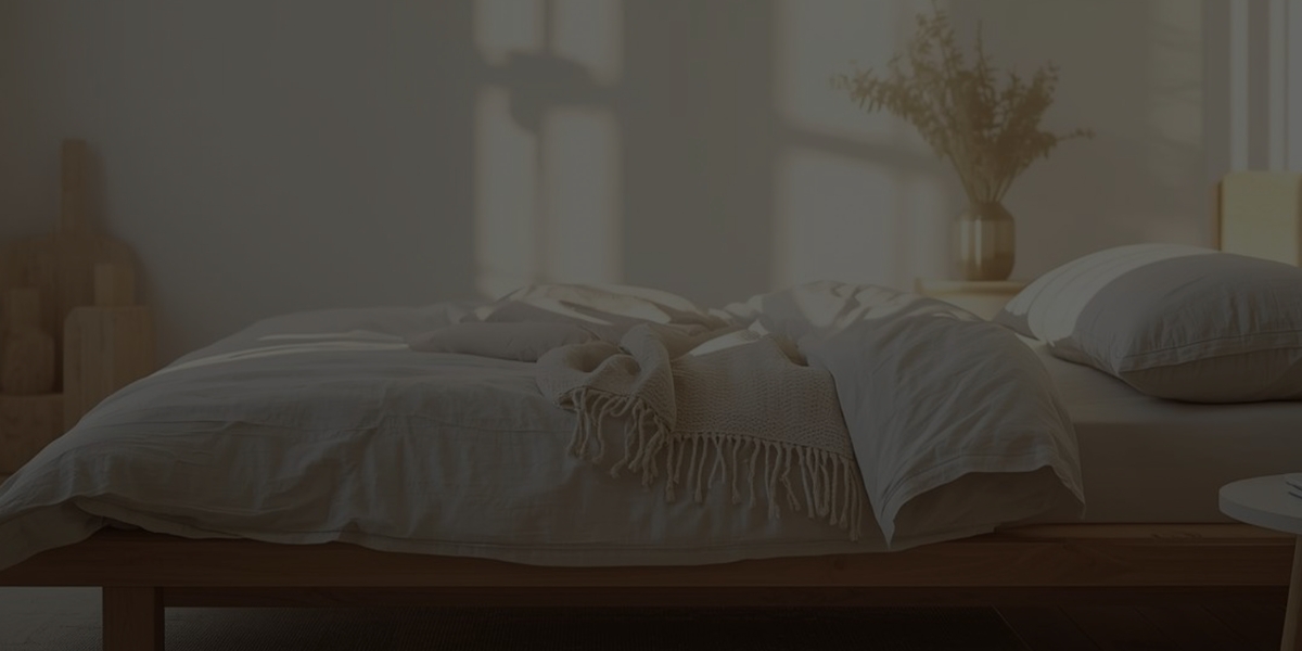
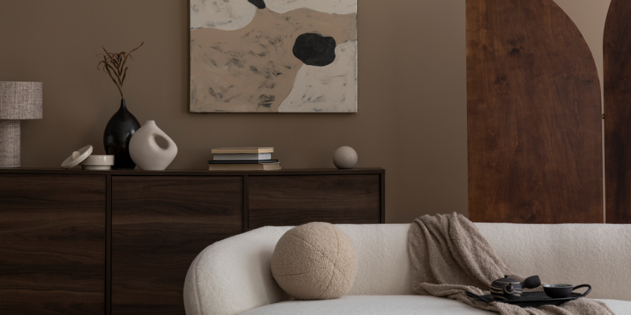
Benjamin Moore named Silhouette (AF-655) as its 2026 Color of the Year—a deep charcoal brown with a subtle violet undertone. The brand describes it as an elegant, grounding hue that brings warmth and sophistication to a variety of interiors. It’s ideal for cabinetry, accent walls, or furniture that adds depth without dominating a space.
Behr – Hidden Gem (N430-6A)
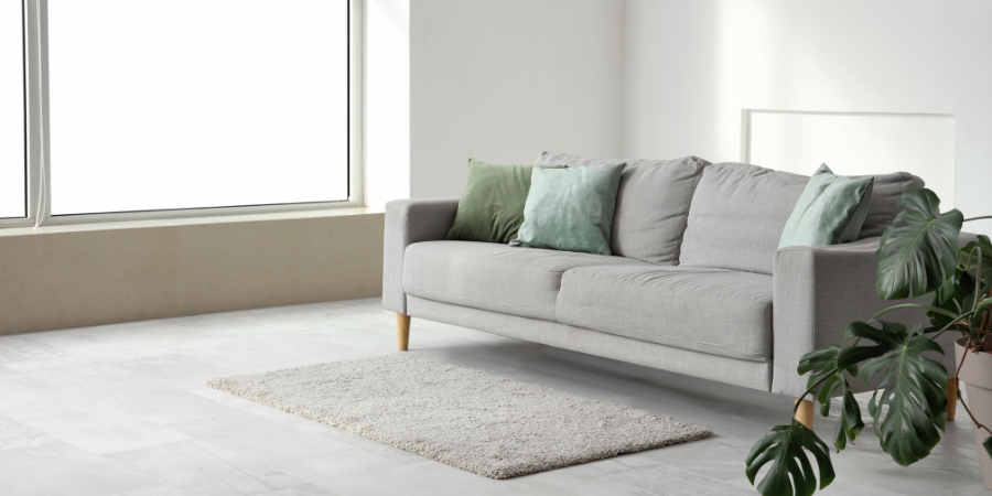
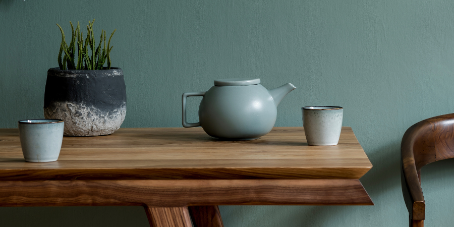
Behr selected Hidden Gem (N430-6A) as its 2026 Color of the Year—a misty blue-green inspired by nature and tranquility. The color was chosen for its calming presence and quiet confidence. It pairs effortlessly with soft whites, natural wood, and warm neutrals.
Sherwin-Williams – Universal Khaki (SW 6150)
Sherwin-Williams introduced Universal Khaki (SW 6150) as its 2026 Color of the Year—a warm, grounded neutral that blends tan and beige with soft gray undertones. The shade was selected for its timeless appeal and ability to bring balance and versatility to both traditional and modern interiors.
How to Use the 2026 Colors in Interior Decorating
Now that we’ve seen the 2026 Colors of the Year, the next question is: how do you actually use them? Whether you’re decorating a home, staging a space, or creating a design portfolio, these trending shades offer a lot of flexibility—with very different moods and applications.
Pantone – Cloud Dancer
Best for bright, minimalist interiors

Benjamin Moore – Silhouette
Great for moody accent walls and cabinetry

Behr – Hidden Gem
Perfect for soft, earthy accents in modern interiors

Sherwin-Williams – Universal Khaki
Perfect as a warm, versatile base color
Pantone – Cloud Dancer
This soft, luminous white is perfect for designers leaning into minimalist, airy, or light-filled interiors. Use it on walls to open up a space or as a grounding neutral to highlight texture and shadow. It pairs well with natural materials like oak, linen, and ceramic.
Best for:
Bright spaces, modern minimalism, gallery-style walls
Benjamin Moore – Silhouette
Silhouette is ideal for adding contrast, drama, or coziness without going full black. It works beautifully on accent walls, furniture, and cabinetry—especially when paired with soft neutrals, dusty pinks, or warm metallics.
Best for:
Moody contrast, feature walls, built-ins
Behr – Hidden Gem
This calming blue-green bridges cool and warm tones, making it incredibly versatile. Use it in living rooms, bathrooms, or home offices to bring in a nature-inspired pop of color without overwhelming the space.
Best for:
Soft color pops, transitional spaces, serene interiors
Sherwin-Williams – Universal Khaki
As the most classic neutral of the four, Universal Khaki makes a great foundational color for full rooms, open-concept spaces, or homes where warmth and timelessness are key. It also layers easily with whites, charcoals, or deep blues.
Best for:
All-over wall color, warm neutral palettes, modern traditional styles
“Comprehensive Curriculum, Accreditation and Certification, Flexible Learning, Experienced Instructors, Support and Resources. This educational journey has not only enhanced my professional credentials but also contributes to personal development and satisfaction.”
Adriana De FreitasQC Design School Graduate
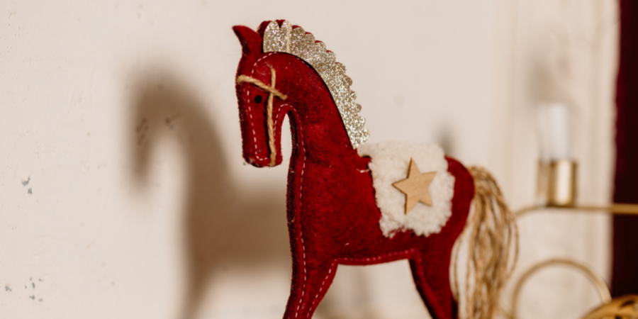
Feng Shui Design: The Luckiest Colors in 2026
In Feng Shui, color isn’t just a design choice—it’s a way to influence the energy of a space. Each year brings new elemental dynamics, and 2026 is the Year of the Yang Fire Horse—a combination associated with movement, ambition, and transformation.
Curious about last years lucky colors? Check out our blog post Feng Shui Design : The Luckiest Colors of 2025.
The Year of the Horse + Fire Element
2026 combines the dynamic Fire element with the passionate and independent energy of the Horse. This pairing encourages action, creativity, and bold decisions—making it a powerful year for using color intentionally.
Luckiest Colors in Feng Shui for 2026
To align with the year’s energy try focusing on the following color groups:
- Red & Coral – Energizing fire colors that promote visibility, motivation, and good fortune
- Green & Teal – Wood element shades that support growth, renewal, and creativity
- Brown & Earthy Neutrals – Grounding tones that bring stability and calm
- Gold & Warm Metallics – Associated with prosperity, abundance, and elevated energy
How to Use Lucky Colors in Your Space
You don’t need to commit to a full-room makeover—these lucky colors can be used in subtle, intentional ways that still align with Feng Shui energy:
- Use red or coral accents in your entryway or office to activate motivation and visibility
- Add green or teal throw pillows, rugs, or art in creative areas to encourage renewal and focus
- Bring in brown or earthy neutrals for furniture, textiles, or wall colors in bedrooms or calm zones
- Try gold or warm metallics in lighting fixtures, frames, or decor to attract prosperity and elevate energy
Expert Tips from Jane Lockhart on Working with Color
Jane Lockhart, QC Design School instructor and award-winning designer, is widely recognized for her HGTV series Color Confidential and as a frequent guest expert on Cityline and The Marilyn Denis Show. She’s also the best-selling author of two books and a trusted voice in the design industry.
Below are five of Jane’s standout color strategies—plus tips for how you can apply them using the trending and Feng Shui–inspired shades of 2026.
1. Create Impact with Light vs. Dark Contrast
When it comes to accent walls, Jane explains that the goal is contrast—not just color. The eye naturally gravitates toward areas where light meets dark. She often uses this principle to guide where an accent wall should go and how to make it stand out.
2026 Application
Pair Cloud Dancer (soft white) with a darker hue like Silhouette to create contrast. This technique works especially well behind a bed, sofa, or workspace.
2. Any Color Can Act as a Neutral
Most people think of neutrals as beige, white, or grey—but Jane says that any color can act as a neutral if it’s used consistently. For example, in a room filled with green tones, green becomes the grounding color.
2026 Application
Pair Cloud Dancer (soft white) with a darker hue like Silhouette to create contrast. This technique works especially well behind a bed, sofa, or workspace.
3. Always Test Colors in Real Lighting
Lighting can completely change how a color appears. Jane stresses the importance of testing swatches in the actual room—under natural daylight and artificial light—before making a final decision. What looks warm in the store might read cool at home.
2026 Application
Shades like Cloud Dancer and metallic gold can shift dramatically depending on lighting. Test before committing to make sure the color feels calming, not cold or harsh.
4. Use Strong Color to Add Visual Weight
In rooms with minimal furniture or styling, Jane suggests using richer or deeper wall colors to visually “anchor” the space. This adds weight and balance, especially in large or open areas.
2026 Application
Silhouette or Universal Khaki can be used to ground a sparse entryway or hallway, making the space feel intentional and complete.
5. Balance Bold Colors with Earthy Tones
If a color feels too loud or intense, Jane tones it down by pairing it with muted neutrals like soft greys, warm taupes, or beige. This not only softens the palette but also makes bolder shades feel more livable.
2026 Application
Pair bold red, coral, or teal accents with a base like Universal Khaki to keep the room grounded and cohesive.
Bringing Color to Life in 2026: Quick Recap
In this post, you discovered:
- The official 2026 Colors of the Year from Pantone, Benjamin Moore, Behr, and Sherwin-Williams
- How to apply these trending shades in home decorating and professional design
- Feng Shui and lucky color insights for the Year of the Fire Horse
- Expert tips from Jane Lockhart on working with color effectively in real spaces
Color isn’t just decoration—it’s direction. When used intentionally, it tells a story, shapes energy, and transforms interiors into experiences.
Take the Next Step with QC Design School
If you’re inspired to take your passion for design to the next level, QC Design School offers flexible, online training that helps you build real-world skills and launch a career with confidence.

Color Consulting Course
- Master color theory, lighting, undertones, and open-concept strategies
- Learn how to guide clients through confident, customized color choices
- Features exclusive video tutorials and expert insights from Jane Lockhart

Interior Design & Decorating Course
- Learn how to design and style interiors from floor plans to final touches
- Build a strong foundation in color, space planning, and furniture placement
- Create a portfolio and prepare to work professionally with clients
FAQs About The Color of the Year
When are the Colors of the Year released?
Most Color of the Year announcements are released toward the end of the previous year, usually between September and December. This timing allows designers, brands, and homeowners to start planning projects and product launches for the year ahead.
Are the Colors of the Year the same for every brand?
No. Each paint brand and color authority selects its own Color of the Year based on trend research, cultural insights, and design forecasting.
How can I use Color of the Year shades in a subtle way?
Incorporate them through accents like pillows, artwork, decor, or a single focal wall. Small updates can make a space feel current without committing to a full redesign.
What are the Feng Shui lucky colors for 2026?
For the Year of the Fire Horse, lucky colors include red, green, brown, and gold, which are associated with energy, growth, stability, and prosperity.
Which QC Design School course is best for learning about color?
QC Design School’s Color Consulting Course is ideal for anyone who wants to specialize in color theory, lighting, undertones, and client-focused color decisions.