Melissa Ujcic is a student of QC Design School’s Color Consultant Course. Today, she reveals 3 color psychology mistakes you should never make as a color expert!

As a color consultant, how do you choose your paint colors? What drives your decisions?
We can start by applying the same train of thought to everyday activities. For example, why do you sometimes feel compelled you to buy a certain dress? Why do you sometimes get the urge to eat a banana or buy a specific car? Are all of these decisions entirely random, or is there something deeper that drives our choices?
Believe it or not, many of our decisions are influenced – at least, to some degree – by color. But why is this? Why does color impact our decisions in such a prominent way? How is this possible when most of the time, we aren’t even aware of it?
The answer lies in color psychology.

Color Psychology in Home Design
QC Design School’s Color Consultant Course teaches you all about color psychology. In a nutshell, color psychology is the way a person reacts to color on an emotional, psychological, and even physical level.
Certain colors are known to bring out certain emotions. In a way, all colors can mean something different to each individual person. For instance, a certain color may trigger a specific childhood memory or feeling, based on past experiences. There are colors that can make you happy, excited, calm, and even angry.
Colors can also make you think of different symbols. A good example is pink. When many of us think of the color pink, we might might think of breast cancer awareness. Similarly, if you see red, you might think “stop”, and when you see, green you might think of wealth or nature.
As a professional color consultant, it’s critical that you understand color psychology. Picking the right colors for the right rooms will help you create the best possible spaces for your clients. Picking the wrong colors can have an unwanted effect.
With this in mind, what are some of the biggest color psychology mistakes a color consultant should know better than to make? Let’s dive deeper into 3 errors you should never commit when working with your clients…
3 Color Psychology Mistakes a Color Consultant Should NOT Make
1. Do NOT choose yellow for small spaces without windows, such as a bathroom.
I am going to be real with all of you: in my own spare bathroom, I made a mistake by painting it yellow! Going into it, I knew it was a small space without a window. Honestly, I should have known better…
Just kidding! Yes, while this is true, we’re all still allowed to make mistakes. That is how we learn.
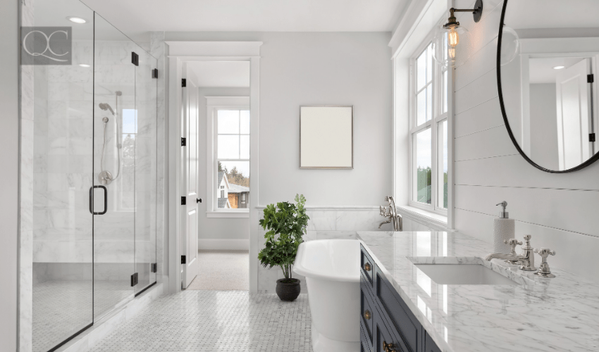
QC’s Color Consultant Course inspired me to redo this bathroom. I always knew I did not enjoy being in there, but I was never sure why. This all changed when I watched one my course’s instructional videos. Here’s what I learned:
Yellow’s complimentary color is purple. So, in a yellow bathroom, you’re going to wind up seeing all of the purple undertones. This is exactly what I was faced with every time I looked into the mirror. Yuck! Talk about unflattering! That won’t make anyone feel good about themselves.
I know what you’re thinking: doesn’t yellow represent happiness, optimism, and summer? Wouldn’t those be positive emotions? Yes, this is true. But in the wrong space, those desired emotions can fall flat. In reality, yellow is the most visually-reflective color. As a result, it can often be too hard on the eyes. This, in turn, can cause headaches.
So, what is a better color for a small bathroom? Ultimately, this will be up to your client. But in this particular case, I am the client and I chose a light gray instead. (Just keep in mind that there are many other flattering colors to choose from.) Personally, I’ve always liked the idea of white shiplap on the walls, or going with a spa look and using a gray/blue combo. Another idea that I think would look nice would be wainscoting; taking up a little more than half the wall and using something darker like a charcoal gray or navy blue.
2. Do NOT choose a vivid red for a bedroom, as your client uses that space to relax.
As a color consultant, you’ll get your fair share of clients who need help selecting the right color for their bedroom. Since this particular space is meant to be relaxing, which color should you pick?
Not red!
You can probably get away with recommending a shade of burgundy, but you should definitely stay away from red. But why is this exactly? According to color psychology, red is known as the most intense color of them all. It can evoke emotions that are counterintuitive to the relaxing atmosphere you’re trying to help them create, as such:
- Excitement
- Passion
- Danger
- Energy
- Action
- Anger
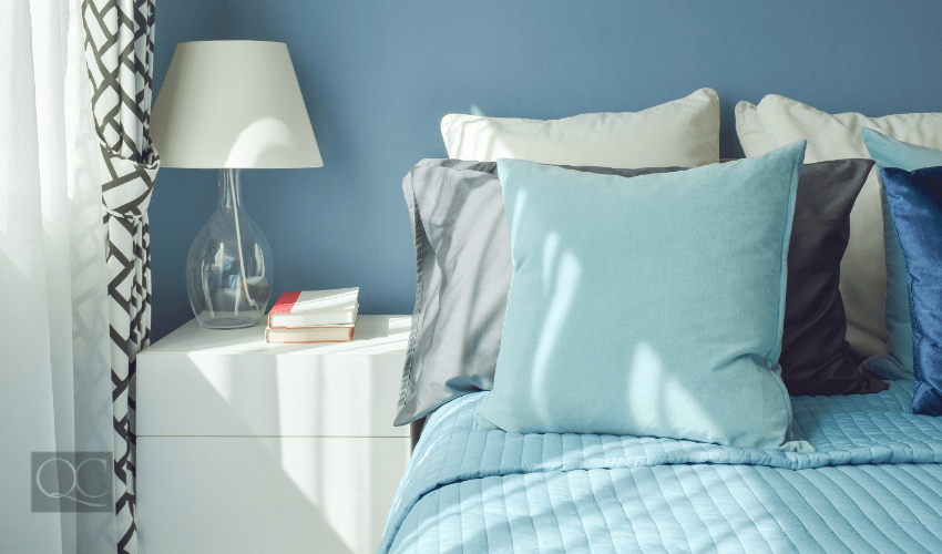
Looking at this color can even lead to a slightly raised blood pressure! This just goes to show why color psychology is so important to keep in mind as a color consultant. You need to understand which effects certain colors can have, so you know where they’re appropriate (and where they’re not).
With all this in mind, which colors should you pick to make a client’s bedroom a peaceful, relaxing oasis? Blue is known for having such a calming power. For this reason, it works really well in bedrooms! Blue symbolizes heaven and sky. It’s said that those who like blue are trustworthy, loyal, friendly, and strong.
3. Do NOT choose a beige with pink undertones if your client doesn’t like pink.
Okay, let’s move on to beige. Beige can tend to have pink undertones – and my husband and I learned that the hard way. Story time!
Back then, we were younger and didn’t yet know this fact. Now, our first house did not get much natural light. (I actually used to call it “The Dungeon.”) You would get the morning light, but by the afternoon, only the upstairs got any sun.
This was when we decided to paint the downstairs walls beige. The only problem was that we did not, in fact, get a perfect beige. Instead, our walls looked PINK! In the world of color psychology, pink is a part of the red family. It’s also perceived as feminine, innocent, and romantic.
While pink can look great in bedrooms, it was far from ideal in this particular space. My husband was doing a lot of the painting himself, and we hadn’t considered at the time that paint can look VERY different once dry. By the time I realized that I didn’t like the color, it was too late. I also did not want to upset my husband (even though I knew he was thinking the same exact thing). This had proven to be a costly mistake.

Picking the Perfect Beige
So, what did we learn? Is the point of my story that you should never paint a room beige? Of course not! It’s just a matter of picking the RIGHT beige.
This is where it’s crucial that we talk about lighting. Lighting can make a major difference in the undertones your client winds up seeing when they look at their wall(s). For example, a yellow light or incandescent light will highlight any pink undertones a beige color has. On the flip side, using a white fluorescent light will help make the beige appear less pink.
(This would have been very helpful knowledge for me back in the day. But then again, this is exactly why I’m now learning and getting trained in my Color Consultant certification course. So, no regrets!)
Here’s a useful tip: once you’ve chosen a variety of beige paint chips and are back in your client’s home, place them in a row, in multiple rooms. Then move from room to room. See how the colors change and look different, according to the lighting.
This will help you choose the perfect beige!
Learning from Your Mistakes as a Color Consultant
These are some of the mistakes I have personally encountered first-hand. But now that I properly understand color psychology, I know that these are mistakes I will never make again! This goes not only for when I’m working with clients, but when I’m choosing a paint color in my own home.
Learning from my mistakes and attending QC Design School’s Color Consultant Course are the reasons why I now feel so confident in choosing the right color for a space.
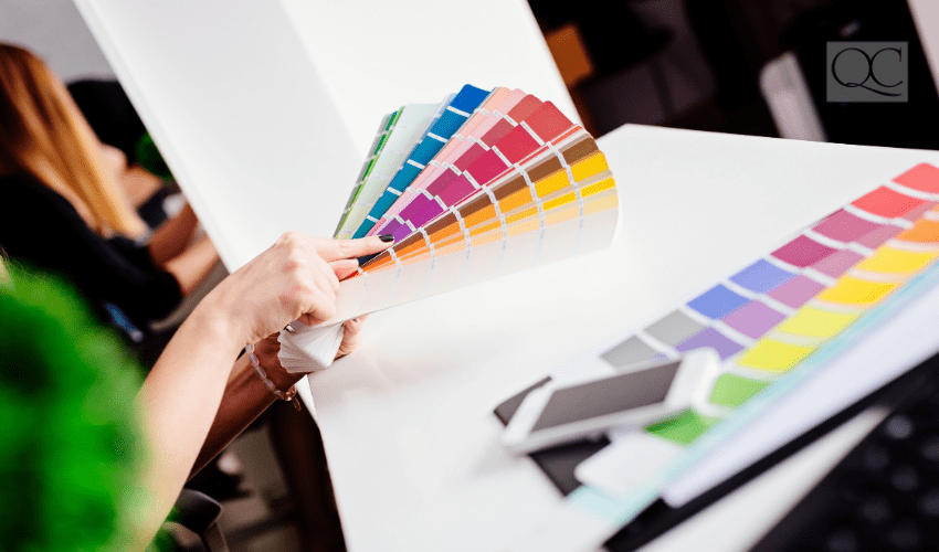
A Preview of a Color Consultant Course Assignment
Right now, I am working on assignment A7. To give you an idea of what I’m learning from this assignment, I’ll provide a brief walkthrough. Basically, I’m tasked with helping a client with her bedroom. Her bedroom is currently too loud and stimulating, and has a lot of yellow throughout.
As part of this assignment, my client would like the room to be more peaceful. Thus, I need to create a place where she can unwind and fall asleep. I’m told that my client likes to paint. She’s open to purchasing new furniture and adding new textiles – but she wants to keep the flooring. The purpose of this exercise is to practice listening to the client and providing her with a result she is going to be happy with.
That’s what I love so much about QC’s assignments: they’re so relatable and really prepare you for real-world situations as a certified color consultant!
Remember: now is the perfect time for change and for you to continue your education. QC Design School has so much to offer! It’s truly the best option for new and experienced designers alike. If you have any questions, please feel free to comment below. You can also connect with me directly in the QC Virtual Classroom on Facebook.
Thank you so much for reading! 🙂
Great article!! The colour consultant course is really great for learning the ins and outs of choosing the right colour for the space!
Thanks for the great tips! Sometimes we forget how much a color can affect how you feel in your home!