Besides decluttering, depersonalizing, and giving the home a top-to-bottom scrub, a fresh coat of paint is one of the most economical home staging tricks. It may seem like a bit of a chore, but we promise it yields BIG results!
And while there are potentially millions of colors on the spectrum (including those we can’t perceive!), there are only about a dozen colors that work well for stagers. Among those is greige. It’s often been touted as the ultimate paint color for a home and is universally loved by designers. If you’ve never heard of it, you’ve been living under a rock!
Piqued your interest? Keep reading to find out what makes greige so special!
Greige? What is that?
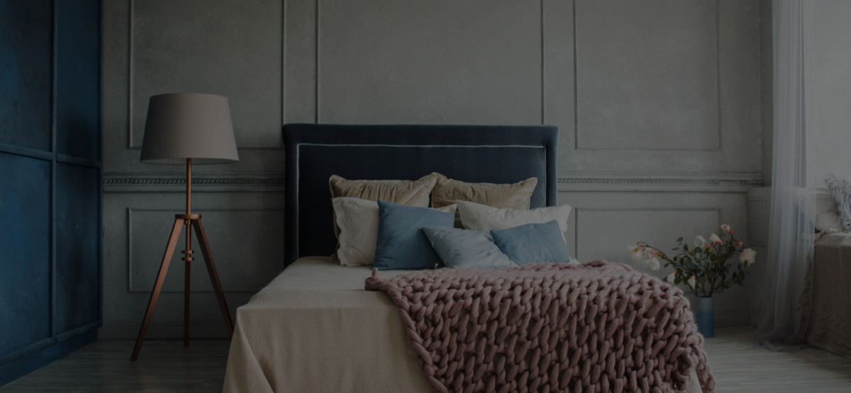
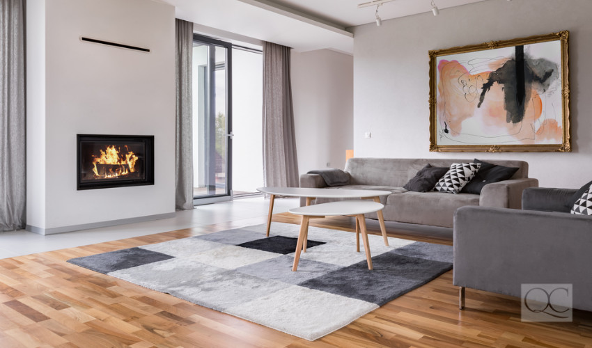
A portmanteau of two famously boring-sounding colors, this color is anything but! The color is gray-based with beige undertones. It’s a lighter, paler version of taupe (gray with brown). Just as taupe is making waves in the makeup world, greige is must-have in the interior design and home staging world.
Why greige is the best choice for home stagers
So why is there such a big fuss for such a seemingly boring color? To start, there’s nothing it doesn’t complement. That’s because it’s a neutral! Neutrals are naturally demure and refined. Whereas beige tends to feel a bit outdated and gray is a bit clinical, greige is effortlessly cool while giving you ample coziness due to its beige undertones.
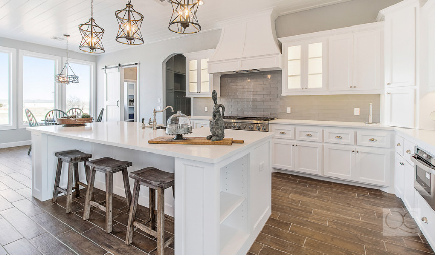
Using neutral colors as the background allow the furnishings, art, and décor in the staged home to pop! Not to mention the fact that these versatile colors don’t make smaller spaces feel cramped. They give any room the illusion of being spacious.
In the case of greige, its lightness compared to taupe means more light bounces around the space, brightening it up. And potential buyers appreciate having a neutral-colored home to move into. Nobody likes to see loud colors decorating the wall of their future home—it only spells extra work!
The most popular greiges
Truthfully, greige has a place both inside and outside the home! According to a 2017 study by Zillow, homes with pale taupe (i.e. Greige!) living rooms sold an average $1,926 more than expected. Additionally, they found that homes with greige exteriors sold for $3,496 more than similar homes painted in other colors.
- Benjamin Moore – Revere Pewter
- Benjamin Moore – Edgecomb Gray
- Benjamin Moore – Balboa Mist
- Benjamin Moore – Pale Oak
- Sherwin-Williams – Agreeable Gray
- Sherwin-Williams – Repose Gray
- Sherwin-Williams – Mindful Gray
- Sherwin-Williams – Popular Gray
How to pick the perfect greige
Even though we may have just narrowed down your options for you, you still have to further narrow it down for every client you work with. If you line up these swatches, you’ll see subtle differences between them. Here’s how you can work with your client to pick the perfect shade for their needs!
Start from the darkest hue on a swatch to see the undertone of the particular shade at its most intense. As you move up, that same color will still be present. So always start from the darkest. Then, compare it to the second darkest color to see how cool or warm it is. This will give you an idea of what the color will ultimately look like.
Other influencing factors on color perception
After you and your client find the paint chip that speaks to you, you then have to paint a small part of the wall to see how the conditions of the home affect how the color appears. Ensure your clients don’t commit to a color in bulk until you do a spot test!
The size of the space, the lighting, and the paint finish all affect how a color looks on a wall. Paint, once applied to walls, usually appears darker. This is due to the expansiveness of the wall and its vertical orientation also means it receives less light.
As for lighting, lightbulbs cast blue, yellow, or orange tones. Decorative lampshades and reflections of colorful objects from outside the windows can alter how a color looks in a room. And the finish of a color can affect how much light reflects or is absorbed when the light hits it. Matte finishes absorb a lot of light making a space appear lighter, whereas gloss finishes reflect light making a space appear darker.
The wall color is also affected by the colors of the décor you’ll be adding to the space after the paint dries. Your eyes automatically make adjustments when it’s forced to compare two colors side-by-side. So be mindful of the color’s undertones when selecting the rest of the color palette!
Think you mastered the art of “greige”? Tell us your favorite color!