Working with your clients on color selection offers them the wonderful opportunity to create a better functioning and flowing space. It determines how they wish to feel in their space and what feelings and goals they want to encourage or avoid. One of the most popular areas of design that supports this method is the art of Feng Shui.
Feng Shui is known as the ancient Chinese practice of focusing on arranging your home in a way that creates balance with the energies (or yin and yang). It encourages a natural directional flow of energy throughout the space, creating a healthy individual and living space that brings success and happiness for all its inhabitants. Color in general has a huge effect on how people feel and interact with their surroundings. How color is incorporated and where it is placed is crucial to any design. Balance of all colors is key to a successful feng shui design.
One of the best ways to encourage successful projects when working with Feng Shui with your clients, is to determine who is using each space.
- What are their goals while spending time in each space?
- How do they want to feel or not feel in the space?
Through the proper use and placement of color in paint, furnishings and décor, your client can successfully feng shui their home through color placement.
Let’s take a look at some great ways that specific colors can be used effectively incorporated to create a successful Feng Shui design in any home or workspace!
Red – The color of luck always comes to mind first when I am working with feng shui design. This highly energetic and passionate color signifies the fire element. Red can wake up a room and bring warmth into a cold, sterile space. This color is very stimulating and works well in south-facing rooms and dining rooms where there is high activity and social interactions. It is also perfect for a front door, making a bold statement that encourages guests to come in.
Colors To Try: Stolen Kiss SW 7586, Red Bay SW 6321
Pink /Peach– This happy color offers a warm and feminine feel while also encouraging love and partnership. It is a receptive color, perfect for a master bedroom to encourage romance. A south accent wall, soft pink throw pillows or delicate artwork with these nurturing colors can work wonders.
Colors To Try: Rachel Pink SW 0026, Aristocrat Peach SW 0027
Orange/Coral – This warm, cozy and uplifting color encourages happiness and social interaction. It works nicely in family rooms and living rooms, especially ones with fireplaces. This color works best in south rooms.
Color To Try: Caribbean Coral SW 2854, Copper Mountain SW 6356
Yellow/Cream/Gold – Cheerful and inspiring, these colors help to stimulate good health. Soft yellow, cream and tan encourage patience and cooperation. These work well in dining rooms, kitchens, and in other active gathering spaces. Be careful with bold yellows. They can be too energetic for some spaces. In kitchens and living rooms, a lighter shade of yellow or cream will work better and offer a more soothing environment.
Colors To Try: Cupola Yellow SW 7692, Lemon Meringue SW 7561

Greens/Blues – These soothing colors work best in rooms where a client wants to inspire healing, encourage tranquility, relaxation, serenity and a general sense of calm. Bedrooms and bathrooms are great spaces for greens and blues. Other spaces can benefit as well, such as the dining room where a client wants to encourage diners to linger and take their time over a long social dinner. Light pale blues and light greens work nicely in laundry rooms to create a sense of cleanliness and calmness, especially if it does double duty as a busy mudroom.
Colors To Try: Copen Blue SW 0068, Quietude SW 6212, Tidewater SW 6477, Refuge SW 6228
Purple/Plum – This creative color inspires spirituality, contemplation and prosperity. It works well in dens, libraries, meditation rooms and bedrooms.
Colors To Try: Soulmate SW 6270, Midnight SW 6264,
Plum Dandy SW 6284
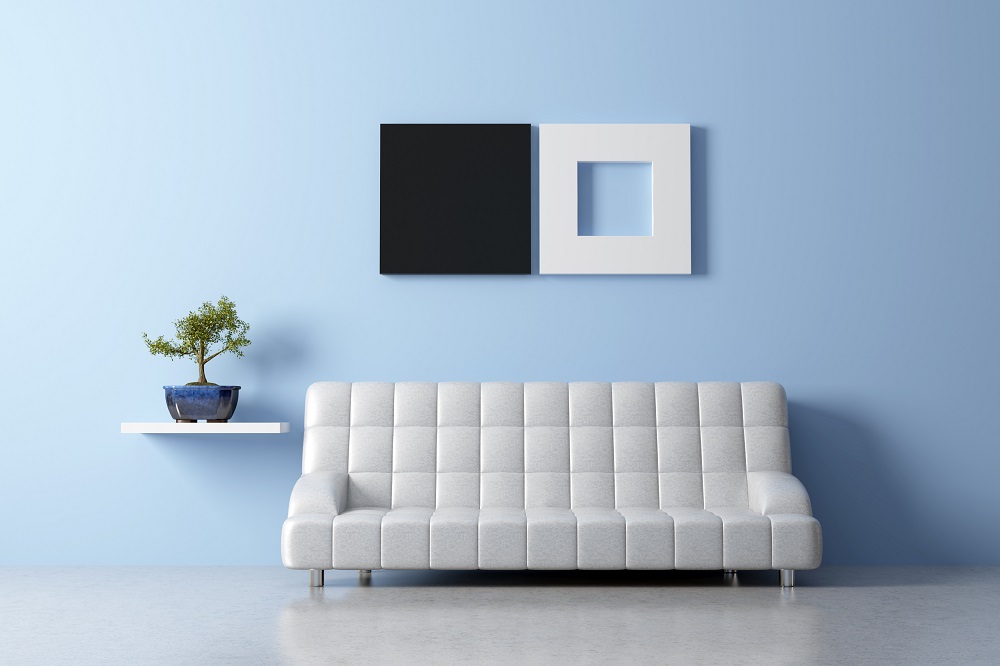
Black/White/Gray – These colors separately and in combination have become very popular. As a heavy color, black works best in small doses such as an accent wall, in finishes like tile and countertops, décor and hardware accents. Flooring is also a great way to pull in this color. A small dose of black can add mystery to a space.
Pairing black with white and/or gray can work wonderfully to bring in a sense of balance to a high contrast space, such as a kitchen where food is the focus, a high traffic laundry room or the home office where money and growth are the focus.
Colors To Try: Eider White SW 7014, Extra White SW 7006, Tricorn Black SW 6258, March Wind SW 7668, Repose Gray SW 7015
White/Neutrals – Whites and neutrals promote communication and clarity. Many clients prefer to work only with neutrals and create a serene scheme for their entire home. By combining white, cream, gray, tans and beige, a home will feel cohesive, soothing, airy and peaceful. This a great solution for clients whose goal is to reduce stress and calm anxiety. Additional accent colors can be added in and rotated with the seasons or as a client’s specific tastes and trends change over time.
Colors To Try: Pure White SW 7005, China Doll SW 7517, Sand Beach SW 7529, Greek Villa SW 7551, On The Rocks SW 7671
As you can see, color plays a HUGE role in feng shui design and how clients relate to their spaces. As a professional designer you have the wonderful opportunity of guiding your clients through the exciting process and assisting them in creating a home that is balanced and healthy and inspires them to live their best life.