When you’re designing a room, the more original your design the better. But be warned: there are a lot of ideas that can go horribly wrong.
Here at QC we like to be adventurous and keep things interesting. However, we definitely don’t want your creative intentions to turn into a disastrous design fail. As an interior decorator, you know what works and what doesn’t. And your usual decorating rules can make things difficult when you’re designing imaginative rooms. After all, you really just want your client to adore their new décor!
Don’t stress if you’ve made theses blunders before. Just be sure to watch out for these design faux pas the next time you land a decorating job!
 Is it 1978 again or did we accidentally wire our DeLorean to take us back in time…
Shag carpets are antiquated design trend. They were popular a few decades ago, but they have no place in today’s world of interior decorating. Not only are they an eyesore—they catch absolutely everything that falls on the carpet which makes them a nightmare to keep clean!
Stay away from shag carpets in your designs; they’re unsightly in modern designs. If you want to include one, a small shag rug can add comfort without overtaking the room. We’ll admit that they feel warm and inviting on our feet!
Is it 1978 again or did we accidentally wire our DeLorean to take us back in time…
Shag carpets are antiquated design trend. They were popular a few decades ago, but they have no place in today’s world of interior decorating. Not only are they an eyesore—they catch absolutely everything that falls on the carpet which makes them a nightmare to keep clean!
Stay away from shag carpets in your designs; they’re unsightly in modern designs. If you want to include one, a small shag rug can add comfort without overtaking the room. We’ll admit that they feel warm and inviting on our feet!
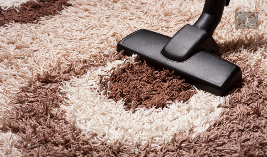
1. Color Clashing
Mixing a bright orange wall with a yellow couch? Think again! The most perilous design fail, clashing colors will destroy a room’s charm. For example, too many bright colors in one room will take away any semblance of comfort and shock your visual senses. That old saying “opposites attract” doesn’t always work in the design world. Watch out when selecting colors to stay away from mixing too many bright shades in one room. On the other hand, too many dark colors can rob a room of its energy. Learn some simple techniques on incorporating dark colors into your designs. Pro Tip: Save bright colors for accent walls or statement pieces like decorative pillows. This draws attention and adds flair without overwhelming guests.2. Shag Carpets
Is it 1978 again or did we accidentally wire our DeLorean to take us back in time…
Shag carpets are antiquated design trend. They were popular a few decades ago, but they have no place in today’s world of interior decorating. Not only are they an eyesore—they catch absolutely everything that falls on the carpet which makes them a nightmare to keep clean!
Stay away from shag carpets in your designs; they’re unsightly in modern designs. If you want to include one, a small shag rug can add comfort without overtaking the room. We’ll admit that they feel warm and inviting on our feet!
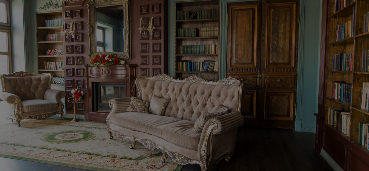
3. Extreme Vintage
On the same page as shag carpets lies the vintage overhaul design fail. Vintage is endearing and we all love a little 1960s flair—picture Audrey Hepburn circa 1961—but we’re definitely not trying to recapture the glory of tie-dye in our homes. Rather than ruining your design with an overpowering amount of bright colors and velvet sofas, try adding vintage accessories. Showing off an old-fashioned rotary phone is way more sophisticated than moss-colored carpet and flower-patterned sofas. An easy way to channel the past is by framing black and white portraits or hanging a classic film poster. Choose images that also function as a conversation piece!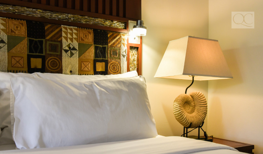
4. Mixed Prints
We’ve all witnessed someone at the supermarket who dresses as half-zebra, half-leopard. Bad print combinations are a design fail waiting to happen. When it comes to designing a room, choose one pattern to make a statement and stick with it. A floral patterned chair with matching pillows for the sofa looks elegant rather than tacky. This way you won’t go overkill on the prints but they still catch your client’s eye! Be sure to use striking patterns in small doses. Choosing an animal print carpet will just engulf the whole space and make you feel like you’re in a Vegas showroom!5. Monotone Rooms
The argument here isn’t that neutral tones are bad. We love neutrals! But when it comes to choosing your whites, beiges and greys you’ll need mix a few shades to add dimension. For instance, a room that’s completely beige is boring. Complement a light beige wall with a darker carpet or hardwood floor. As for the furniture, go with a neutral tone like light grey or chocolate brown. Remember that it’s possible to remain neutral and create depth at the same time! Accent walls work well with neutral rooms. Paint your focus wall darker or with a subtle pattern, like light-colored stripes. Learn the keys to proper home décor with this online design course!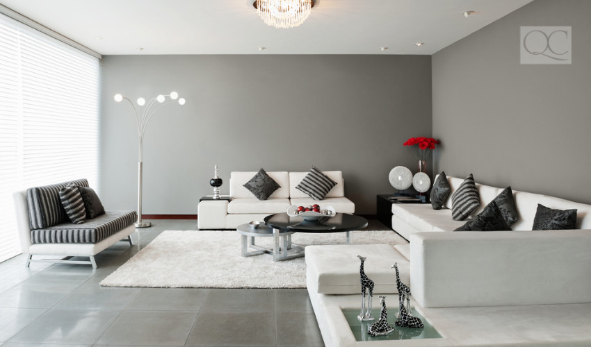
6. Plastic Light Fixtures
The world is moving in a sustainable direction. And you should too in your designs! Plastic light shades are definitely not a good look for any room. Especially if you’re designing an elegant dining room or front entryway, plastic is not a quality choice for your client. These fixtures look tacky and cheap—a style you don’t want your design to emulate. If you don’t have the budget to splurge on a crystal chandelier, don’t worry! Have a look at light fixtures that incorporate glass or metallic colors. These are more ornate than simple light shades. Plus, glass décor is a foolproof way to make any room look chic!7. Barren Spaces
Minimalist décor is a hip trend in today’s world, but that doesn’t mean you have to purge your space of all belongings! Don’t get hung up on keeping a room too immaterial—living minimalist isn’t supposed to make you feel isolated. Instead, use light colors to create an open atmosphere in your designs. Or focus on keeping furniture clear and out of the main footpath. If a room looks like it should be part of an open house, include some blankets to make it feel homely.