
About 8% of men and 0.5% of women are color blind. So out of every twelve clients you’ll work for, one of them will be color blind. You probably think it’s a significant amount—and it is. But not all color-blind people see the world in black and white. Total color blindness is super rare!
Most people who experience color blindness often have a reduced ability to see distinct colors. Red-green color blindness is the most common followed by blue-yellow color blindness. As a result of this condition, some colors blur together or look muddy.
So when your whole career revolves around brilliant color variations, how do you help the color blind? Read on to find out!
Color Creativity
We need to address a misconception before we can begin. Many designers believe that creative restrictions can spell disaster. Especially if you’re already halfway through your plans before discovering your client is color blind! You chose those specific color schemes for a reason, after all. But the changes made can actually expand your creative range, critical thinking, and technical skills.
Your artistic integrity doesn’t need to suffer. After all, if you have professional color consultant training, you’ve probably been put to the test many times during your training. All those assignments, case studies, and color theory quizzes? Don’t tell us you didn’t learn anything!
Not everything you create has to suit your own tastes. Consider the style, interests, and personality of your client. Even if they love analogous color schemes and you think that a particular scheme has no place in a home, it doesn’t matter! It’s all to what your client likes. Once you understand which colors become muddy and are not easily distinguishable for each person, you can become a better designer for your client. And, consequently, become a better designer for yourself.
Color combinations to avoid:
You already know that every individual is different. Even outside of their differing lifestyles and decorating styles, you’ll have clients with differing severities and sensitivities on the color blindness spectrum. We’re not going to get into the technical terms and definitions in this article. Each type of color blindness has their own variety of subsets. So when someone says they’re color blind, you really need to ask questions!
Here are just some of the common color combinations to avoid:
- Red-Green
- Blue-Purple
- Blue-Green
- Green-Brown
- Blue-Grey
- Green-Grey
- Light green-Yellow
- Green-Black

Designing with Color
When working with color blind clients, you first determine the colors to avoid. Then, you need to figure out where you would normally place these colors for a certain effect and make substitutions. Whether you’re working alongside a designer or offering multiple services to your client, this affects you!
Imagine you’re professionally organizing a kitchen. If your clients are often busy, they may need a color-coded mail sorting and/or task sorting system. These tested systems can still work. But you need to research which colors are optimal for differentiating the many tasks and categories.
In the example of clients with deuteranomaly, they have a weaker sensitivity to green light. This results in difficulty distinguishing violet from blue and vice versa. Yellow and green colors also appear warmer. Knowing this, you’d want to avoid having both blue and violet colors on the same board. When 50% of the board appears the same, it sort of defeats the purpose of the organized color profiles, doesn’t it?
Don’t just rely on the colors to do the work. If you want to use blue in the bedroom to invoke a sense of calm, it may not work for those with tritanomaly. They see blues as greener than they actually are. If the point is to create a relaxing space, combine color with other visual cues. Which leads us to our top tips for decorating with color for color blind clients!

Top Tips:
As with most things, you’ll get better at working with color blind clients the more practice and experience you get. But it can be tricky when you’re working with a color blind client for the first time. As such, here are our fail-safe tips that you can test out. Of course, our most important tip is to consult with your client and show them plenty of color swatches!
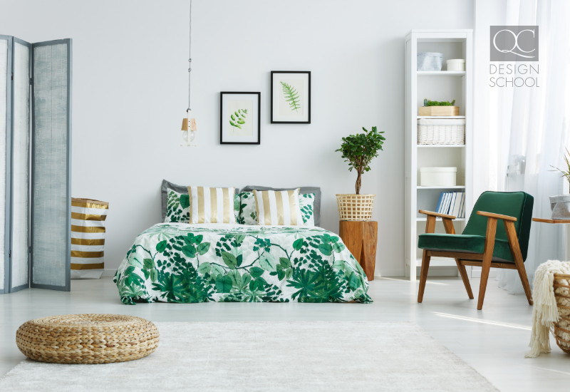
- Play with monochromes: The Scandinavian aesthetic makes it easier than ever to make use of trend. A monochromatic color scheme is when you decorate in varying tones of the same hue. It may not work for all spaces, but if you stick to neutrals and have a couple plants to liven up a space, your clients will be all set.
- High contrast: Closely linked to our last point, increasing the contrast helps those who have trouble distinguishing between similar hues. Going back to the example with a task board, if you’re printing words onto colored labels, ensure the color contrast is high between the words and the background.
- Brightness & saturation: If the saturation and brightness levels are too similar, this, too, can cause troubles. Find creative ways of using that pale blue with the royal navy blue, and you can add to your portfolio!
- Play with texture & tone: You’d want a wide variety of different textures anyways. But now there’s an actual layer of necessity outside of aesthetics. Many color blind people are quite good at distinguishing between textures and tones. It’s how they distinguish between similar colors and extract meaning.
- Patterns: Use different patterns and shapes to distinguish between similar colors. From wallpaper to art pieces, different patterns helps those with color blindness discern their furnishings and decor from surrounding pieces. Nobody wants to pay for a home transformation that they can’t fully appreciate!
Any tips you want to share with other readers? Comment down below!