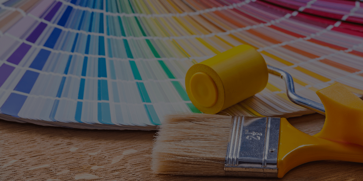
Christina Kittelstad is a tutor of QC Design School and an accomplished color consultant, home stager, and painter. Her work has been featured on HGTV’s show, “House Hunters”. She’s also the owner and lead color consultant for Spiral Design Color Consulting. Christina is best known for creating beautiful, functional spaces through the use of color, and creating a sense of style and personality that’s as unique as each of her clients. Today, she reveals 6 tips for acing your assignments in QC’s Color Consultant Course!
It’s been a rollercoaster of a year, full of challenges and new ways of doing life. The interior design industry has been of no exception! Whether you’re a color consultant or a client, you’ve no doubt had to navigate new shifts in living environments. Some ways you might have adjusted include:
- Transitioning to working remotely;
- Limiting travel for business and pleasure;
- Creating home learning environments;
- Creating functional and motivating areas to exercise;
- Getting back to spending more time in the kitchen, cooking healthy meals;
- And spending more time at home in general.
Spending so more time in our homes these days has created a need for more creative, fun, innovative, and functional spaces. On top of their original functions, our homes must also now help us to stay on task, stay motivated, and embrace life in this new normal.
Looking to the Future
In 2021, color palettes will need to focus on creating spaces that are:
- Light, balanced, and calm
- Nurturing, healthy, and tranquil
- Creative, authentic, and inspiring
- Earthy, cozy, and functional
So, which colors and color palettes should a color consultant recommend to their clients in the New Year, in order to inspire these feelings and emotions? Let’s find out!
The Best Colors to Recommend in 2021 as a Color Consultant
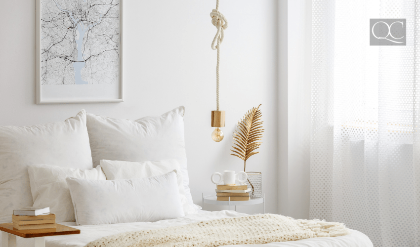
1 – Simple and Warm Whites
Whites are clean, fresh, and neutral. They work with any design style and in any space. In 2021, we will see more clients wanting to warm up their homes and keep it simple.
Whites can be used as the perfect backdrop for the increasing activity happening throughout the home (thanks to being home more often). These colors are perfect to complement bolder accents, such as:
- A beautiful piece of art
- Striking furnishings
- Simple, earthy textures (i.e. leather, bronze, pottery, and textiles)
Recommended Colors
- Pure White SW 7005
- Snowbound SW 7004
- Alabaster SW 7008
- Casa Blanca 7571
- Creamy SW 7012
- Eider White SW 7014
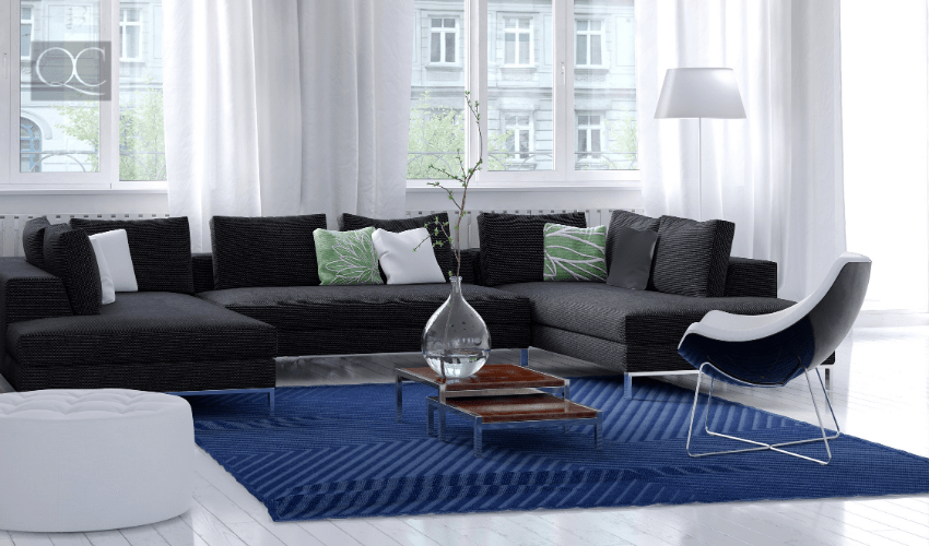
2 – Charcoal
This color continues to be popular, and for a color consultant, it’s no surprise why! Charcoal creates a more dramatic, richer space for your client to retreat to. It works well as an accent on cabinetry, kitchen islands, accent walls in living areas, and bedrooms.
Recommended Colors
- Urbane Bronze SW 7048
- Ion Ore SW 7069
- Black Fox SW 6258
- Black Bean SW 6006
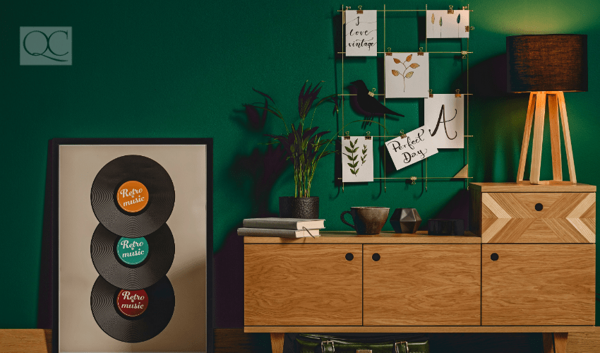
3 – Rich Greens
The color green brings the outside in. It can help us to feel more connected to nature. Not to mention, it’s also fun and vibrant! Jade, emerald, sage, olive, and Kelly greens are especially perfect right now.
If your color consultant clients are looking to bring life into their space, add depth, and show some personality, you can recommend applying green accents or overall color to any of the following places:
- Living rooms
- Offices
- Playrooms walls
- Kitchen islands
- Dining rooms
Recommended Colors
- Cape Verde SW 6482
- Alexandrite SW 0060
- Pewter Green SW 6208
- Messenger Bag 7740
- Cascade Green SW 0066
- Gallery Green SW 0015
- Greens SW 6748
- Roycroft Mist Gray SW 2844
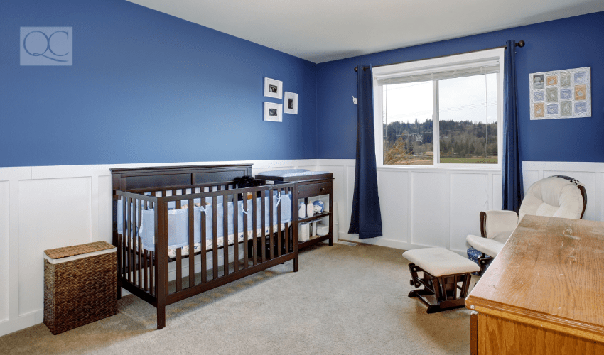
4 – Deep Blues
Blues have been popular throughout 2020. They were even considered to be one of Feng Shui’s lucky colors this past year. This color’s popularity will carry over into 2021 as well!
You’ll see plenty of color consultant clients bringing in new colors that complement their current color schemes. Many will want to add a touch of boldness and depth to their designs. Deep navy blues, fresh sky blues, smoky blues, and royal blues are all on point for 2021!
Blues are everyone’s favorite color, likely because they’re so versatile. The right blue can work wonders in any room, especially in an:
- Office
- Living room
- Kitchen island
- Bedroom space
Recommended Colors
- Naval SW 6244
- Midnight Moscow SW 9142
- Salty Dog, 9177
- Blustery Sky SW 9140
- Smoky Blue SW 7604
- Refuge SW 6228
- Tranquil Aqua SW 7611
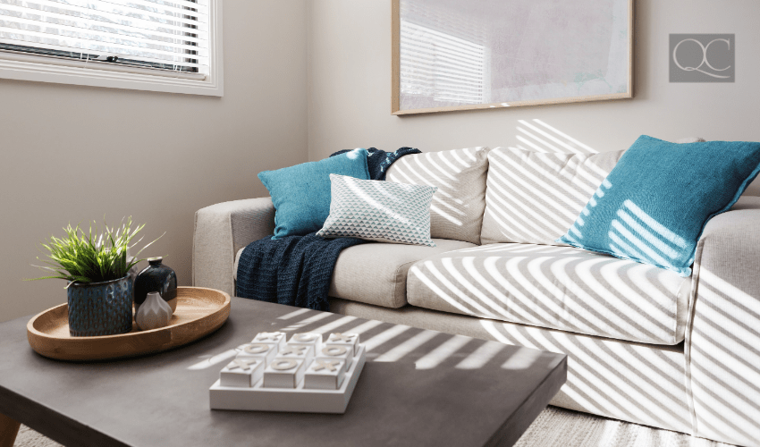
5 – Teal
This color of the year is gorgeous! Teal brings that perfect pop of rich color to any space, and works well with most neutrals. Whether it’s a dark, moody teal or a light, coastal teal that evokes the feeling of being on vacation – there’s a perfect teal color for everyone!
Bringing this color in as an accent will wake up any room! As a color consultant, take note: this will be a BIG color to watch for in 2021.
Recommended Colors
- Agean Teal BM 2136-40
- Really Teal SW 6489
- Blue Peacock SW 0064
- Rookwood Sash Green SW 2810
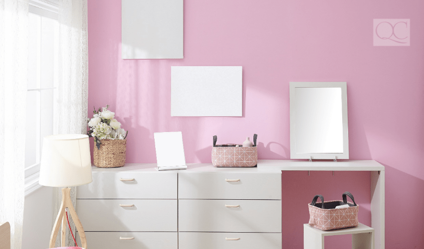
6 – Pink
The color pink has a cult following, so needless to say, it’s not going away anytime soon. In all its glory, pink offers a soft retreat, a flare for fun, creativity, and individualism. I think we can all agree that 2021 sure needs some of that!
Whether it’s the ever popular blush pink, coastal coral, or bold fuchsia, this color is beautiful in a master bedroom, home office, nursery, playroom, or anywhere that needs a shot of bright and brave color.
Suggest pink to your color consultant clients who want to make a statement!
Recommended Colors
- Love and Happiness BM 1191
- Jaipur Pink SW 6577,
- Mellow Coral SW 6324
- Blushing SW 6617
- Intimate White SW 6322
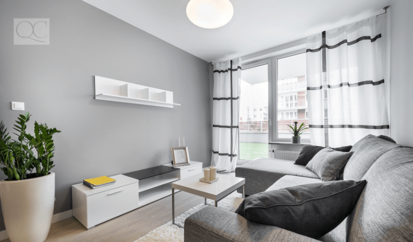
7 – Creamy Grays
Grays are practically always popular, namely because they’re a tried and true neutral. They offer a fresh, light feel to any room. In 2021, we will see the continued trend of grays moving away from heavier, cooler tones – instead, opting for lighter, creamy grays.
These lighter hues register like an off-white at times, but offer a bit more depth, as well as a touch of hygge. Creamy grays work beautifully when combined with other warm neutrals.
Recommended Colors
- Modern Gray SW 7632
- Pearl Gray SW 0052
- Heron Plume SW 6070
- City Loft SW 7631
- Egret White SW 7570
8 – Warm Neutrals
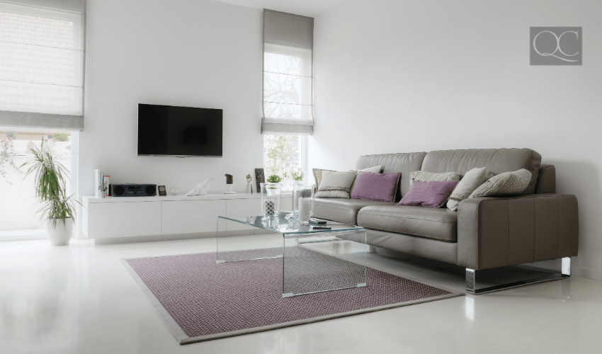
Next year, we will continue to swing away from cool grays. Instead, color consultant clients will be more inclined to gravitate towards more neutral and warm grays, greiges, taupes, and creamy neutrals.
The beauty of these colors is that they all flow together in perfect harmony. Warm neutrals create a well-curated space that flows from room to room, with an understated ease that makes any space feel perfectly like home. This color palette is a win-win!
Recommended Colors
- Agreeable Gray SW 7029
- Repose Gray SW 7015
- Accessible Beige SW 7036
- Popular Gray SW 6071
- Realist Beige SW 6078
- Bona Fide Beige SW 6065
- Lightweight Beige SW 6092
- Bungalow Beige SW 7511
9 – Rusty Red, Clay, and Golds
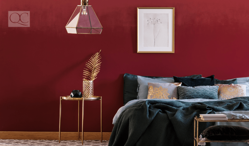
These warm, earthy colors are FINALLY making a comeback after some time. Many color consultant clients are taking time to reconnect with nature. Thanks to being stuck indoors all of the time, they want to create a home that feels calm, grounded, and supportive.
As the pandemic continues, clients will continue to spend more time indoors; re-engaging in meaningful activities that nurture our everyday life, such as gardening, baking, and other creative pursuits. These colors will be the perfect backdrop!
Recommended Colors
- Canyon Clay SW 6054
- Reddened Earth SW 6053
- Decorous Amber SW 0007
- Rookwood Red SW 2802
- Cajun Red SW 0008
- Roycroft Copper Red SW 2839
- Birdseye Maple SW 2834
The upcoming year is ushering in exciting new opportunities for growth, balance, creativity, innovation, and reconnection. People everywhere will have the opportunity to create a home that is unique to their individual needs and desires.
By consulting with our clients on which colors will work best for their unique goals and lifestyles, we are offering much more than just a color palette to work from. We are helping them create a home that reflects who they truly are, and how they want to live in the New Year!

