If you’re reading this, you’re probably thinking about following your passion for staging. Hey, the heart wants what the heart wants! But don’t fall before you even get your feet off the ground. As with any life-changing endeavor, you’ll want some safety nets in place. One way to create opportunities for yourself is to ensure you get a quality education!
Earning a home staging certification means studying up on hard decorating skills along with client psychology. Your job is to appeal to any potential buyer who comes across the home you’re staging. But some people believe that you can’t be too creative with your staging décor. This may be due to the conception that home staging is more restrictive creatively compared to interior decorating.
It’s true, personalization goes hand-in-hand with interior decorating. But you can still get creative with your staging designs! Take using seasonal colors, for example. You can still advance the goals of home staging while garnering inspiration from the seasons and weather. Curious to learn more? Keep reading!
Focal points
This article is all about using seasonal colors in your staging efforts. But before we can get into it, we need to first address your biggest consideration when it comes to color choice: the room’s focal point!
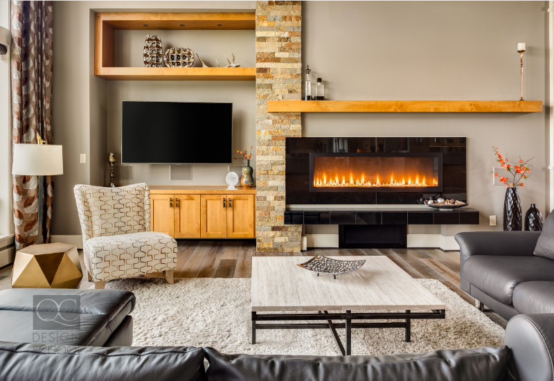
You can usually figure out a room’s focal point pretty easily. This could be the giant fireplace in the center of the living room or the bay window with the breathtaking view. Didn’t know that windows and the outside space could be a home’s focal point? It’s just one of the many secrets that those with a certification for home staging keep under wraps!
The tricky part comes when you need to create a focal point when there isn’t one readily available! This may sound difficult and expensive at first—but all you need to do is consider the function of the space.
When staging a home, you’ll want each room to have its own distinct function. When the lines are muddled—especially in open concept homes—potential buyers have a hard time seeing how they’ll use a space. Ensuring that you answer all questions subconsciously for them is how you’ll find success as a professional stager.
Working with the focal point
The dining room table is the focal point of its eponymous room. When staging a table, you’ll want to work with the colors of the table, whether it’s the homeowner’s table or one brought in from your stock. You can go as little as including a bowl of McIntosh apples atop a festive table runner for fall. Or, use some fresh yellow tulips to ring in springtime!
Your colors should accentuate the focal point or lead the eyes towards it. It’s easy to use the colors typically associated with the seasons, as in the examples above. But you also don’t want to just use the same exact color all over the house. Always look for ways to add variety when it comes to décor and colors. So how can we go about doing this? Enter: color schemes!

Color schemes
Let’s take the fall season for example. You probably start off envisioning warm and cozy colors. Oranges, yellows, and reds … they’re all found in fall foliage! But these colors don’t just work because we can find concrete examples of them in nature. There’s an actual relationship between them! These three colors are part of an analogous color scheme.
A what? Analogous colors are three colors positioned next to each other on the color wheel. Because they naturally transition from one to the other, they work in perfect harmony! You may want to decorate a space with this color scheme, for example. Or, you could also choose a color to use as the basis for a monochromatic color scheme. That is, choosing just one hue and using it in different tints, shades, and tones.
Your options aren’t just limited to these basic schemes, though. Split complementary, triad, and tetrad schemes are common. The two we mentioned in detail makes it easier to introduce a seasonal theme to any space, though! Our last piece of advice? Ensure that your color scheme isn’t just primary and accent colors! You also want to include a neutral base color like greige. These colors will allow you to decorate with colors while ensuring that on-lookers aren’t overwhelmed.
Color association
Now you know what you need to do. The next step is learning how to go about choosing the best colors for your client’s home. Obviously, you’ll want to consider the colors already existing in the home. If your clients and you have decided to paint the walls, you can use this to your advantage. Pick a neutral color, but ensure it has undertones that complement your seasonal colors.
To choose a good starting point for your color scheme, you’ll want to play with color associations. What colors best convey the moods of the different seasons? Certain hues bring about specific smells, sounds, textures, and other sensations. Some of these memories and sensations are shared by all due to what’s found in your local environment and culture. Here are some examples of colors by the seasons:
- Red: Commonly associated with the Christmas and the holiday season, this color is a safe bet when staging a home during the holidays
- Orange: Autumnal leaves, pumpkin spice lattes, and Halloween!
- Yellow: This is a stimulating color associated with the sun, hope, and energy. It brings to mind summer weather.
- Green: Strong associations with growth and nature (it’s the color of plants, after all), this calming color is great for the spring!
- Blue: A relaxing shade often used in the bedroom to promote relaxation. Darker shades work well in the winter, while lighter shades have a cooling effect in the hot and humid weather.
- Violet: This purple shade isn’t found as widely in nature compared to the others. But it can certainly be used as an accent color in accessories to balance the other seasonal shades.
Don’t worry if you haven’t mastered pairing colors yet. It all comes with practice! If you have any tips to share with other aspiring home stagers, leave a comment below.
